
Color is the single most powerful design variable in any kitchen renovation. It sets the mood before you open a cabinet, influences how hungry you feel, and determines whether a room reads as spacious or cramped. Understanding the role of color in kitchen renovation means understanding how every surface, from cabinet fronts to wall paint, works together to shape your daily experience. Get it right, and your kitchen feels like the heart of your home. Get it wrong, and even expensive finishes will feel off.
Color psychology is the study of how specific hues trigger emotional and physical responses. In kitchens, those responses are immediate and measurable. Warm colors stimulate appetite and social interaction by activating the nervous system, while cool colors calm the body but can suppress appetite. That is why fast food chains use red and yellow, and why spa kitchens lean toward sage green or soft gray.
Here is how the most common kitchen colors affect mood:
Yellow and terracotta: Stimulate energy, appetite, and conversation. These are strong choices for open-plan kitchens where the space doubles as a gathering area.
Red: Raises heart rate and creates urgency. A full red kitchen feels intense over time. Use it as an accent color rather than a dominant one.
Blue: Calming and clean. Blue works well in health-focused or minimalist kitchens, but cool colors suppress appetite, so avoid it if your kitchen is your social hub.
Green: Balances energy and calm. Sage and forest green are the breakout colors of 2026 because they feel natural without being cold.
Warm neutrals (taupe, sand, mushroom): These create soft, inviting kitchens and mask dirt and wear far better than bright white or stark gray.
Neutral colors create balanced emotional environments. They do not excite or suppress. They simply let the kitchen function without the color itself becoming a distraction.
Pro Tip: Before committing to a bold color, live with a large paint swatch on your wall for at least a week. Observe it at breakfast, midday, and evening. The color you love at noon may feel wrong at 7 a.m.
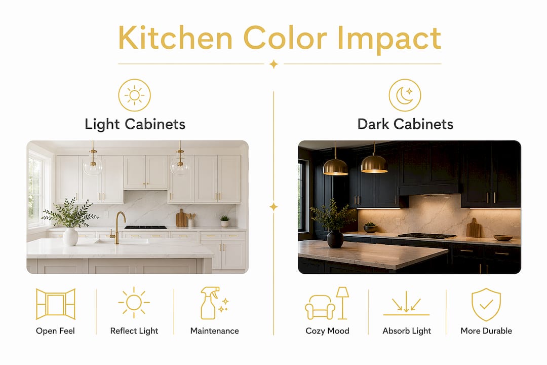
Cabinet color is the strongest design variable for kitchen atmosphere. Cabinets cover more surface area than any other element, so their color sets the baseline mood the moment you walk in. Cabinet color impacts kitchen mood instantly by shaping emotional comfort and buyer perception. That matters both for daily living and for resale value.
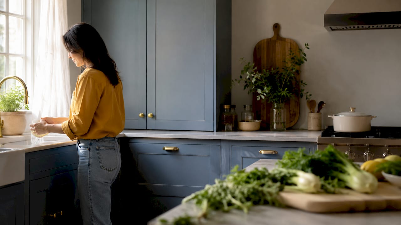
Light cabinets, including off-white, cream, and pale gray, make a kitchen feel larger and more open. They reflect light and create an airy quality that works especially well in smaller kitchens or rooms with limited natural light. Dark cabinets, such as navy, forest green, or charcoal, add depth and drama. They work best in larger kitchens with strong lighting.
| Cabinet Color | Effect on Space | Maintenance Reality |
|---|---|---|
| Pure white | Feels bright and open | Shows fingerprints and yellows over time |
| Off-white or cream | Open and warm | Hides wear better than pure white |
| Gray | Modern and neutral | Can feel cold without warm accents |
| Navy or dark blue | Bold and grounded | Hides grime but shows dust |
| Sage or forest green | Natural and calming | Forgiving with everyday use |
| Black | Dramatic and sleek | Highlights fingerprints and wear |
Pure white and black cabinetry present real maintenance challenges. White shows every smudge, and black absorbs light in ways that make smaller kitchens feel enclosed. Both colors also reveal wear patterns faster than mid-tone options.
The 2026 trend data tells a clear story. Green appears in 86% of kitchens and blue in 78%, while gray preference has dropped to 43%. Gray dominated kitchen design for nearly a decade, but homeowners are now choosing colors with more warmth and personality. Green and blue offer the same visual calm as gray without the coldness.
Pro Tip: If you love white cabinets but worry about maintenance, choose a warm white or linen finish instead of a stark, cool white. It reads as clean and bright while hiding everyday wear far better.
Organized cabinetry with well-chosen colors also reduces visual clutter and cortisol levels, which means your color choice affects more than aesthetics. It affects how stressed you feel in your own kitchen.
The 60:30:10 rule is the most reliable framework for creating a harmonious kitchen color scheme. The rule works like this: 60% of the space uses a dominant color, 30% uses a secondary color, and 10% uses an accent. The 60:30:10 color rule prevents any single color from overwhelming the space while keeping the palette cohesive.
Here is how to apply it step by step:
Choose your dominant color (60%). This is typically your cabinet color or wall color. It sets the overall tone. A warm white, sage green, or navy blue works well here.
Select your secondary color (30%). This covers walls, a large backsplash area, or open shelving. It should complement the dominant color without competing with it.
Pick your accent color (10%). Hardware, light fixtures, a kitchen backsplash tile detail, or bar stools carry this color. Brass, matte black, and terracotta are strong accent choices in 2026.
Test the combination in your actual space. Paint large swatches and place material samples next to each other under your kitchen lighting before finalizing.
| Cabinet Color | Wall Pairing | Accent Color |
|---|---|---|
| Sage green | Warm white or cream | Brass hardware |
| Navy blue | Light gray or white | Natural wood |
| Off-white | Soft taupe or greige | Matte black |
| Charcoal gray | Pale blue or white | Copper or terracotta |
| Terracotta | Warm white | Deep green |
The backsplash is your best tool for introducing an accent color without committing to it everywhere. A kitchen countertop in a neutral quartz or butcher block can also anchor the palette and give you flexibility with bolder cabinet or wall colors.
Lighting changes color more than most homeowners expect. A paint color that looks warm and inviting in the showroom can appear cold and flat under fluorescent kitchen lights. Lighting and materials must be considered together with color to avoid kitchens that feel sterile or visually inconsistent.
Key lighting facts every homeowner should know:
North-facing kitchens receive cool, indirect light all day. Warm colors like cream, yellow, and terracotta compensate for this and keep the space from feeling cold.
South-facing kitchens get strong, warm light. They can handle cooler colors like blue and gray without the space feeling harsh.
Incandescent and warm LED bulbs bring out the warmth in yellows, reds, and wood tones. They make cool colors look muddier.
Cool white LED bulbs sharpen blues and greens but can make warm neutrals look washed out.
Smart lighting with circadian rhythm settings adjusts color temperature throughout the day, supporting both morning energy and evening relaxation in the same kitchen.
Materials also interact with color in ways that change the overall feel. Matte surfaces absorb light and make colors look deeper. Gloss surfaces reflect light and make colors appear brighter and more saturated. Wood tones add warmth to any palette. Metals like brass and copper push a kitchen toward warmth, while chrome and nickel keep it cooler and more modern.
The most expensive color mistake is choosing a color that looks great in photos but fails in daily use. Caitlin King of Wrap Your Kitchen warns that colors often fail in daily use because lighting changes and wear become visible in ways a photograph never captures. A glossy, deep charcoal cabinet looks stunning in a staged photo. After six months of cooking, it shows every water spot and grease smear.
Avoid these common pitfalls:
Neon and extreme high-contrast colors look dated quickly. Neon colors and extreme dark hues often feel tired within one to two years due to visual exhaustion and visible wear.
Choosing based on trends alone. Trends shift. A color that feels current today may feel dated in three years. Choose colors you genuinely love and that fit your lifestyle.
Ignoring your natural light. A dark, moody kitchen works in a bright, south-facing space. The same color in a north-facing kitchen will feel oppressive.
Skipping the sample stage. Never commit to a color from a small chip. Paint a large swatch, at least 12 by 12 inches, and live with it for several days.
Forgetting resale impact. Color plays a larger role than ever in how buyers connect with a home. Highly personal or polarizing colors can limit your buyer pool.
Pro Tip: Warm neutrals like taupe, sand, and mushroom are the safest long-term choices. They feel current, hide wear, and appeal to the widest range of buyers if you ever sell.
Color choice is the most impactful and most underestimated decision in any kitchen renovation, shaping mood, perceived space, and long-term satisfaction every single day.
| Point | Details |
|---|---|
| Cabinet color sets the tone | Cabinets cover the most surface area, so their color defines the kitchen’s baseline mood. |
| Warm colors energize, cool colors calm | Yellow and terracotta stimulate appetite and socializing; blue and green promote calm. |
| Use the 60:30:10 rule | Assign 60% to a dominant color, 30% to a secondary, and 10% to accents for a balanced palette. |
| Test colors under real lighting | Showroom colors look different at home. Always test large swatches in your actual kitchen light. |
| Avoid extreme colors for longevity | Neon and high-contrast dark hues show wear fast and can feel dated within one to two years. |
After working with hundreds of homeowners on kitchen renovations, I have noticed one pattern that separates satisfying renovations from regretted ones. Homeowners who choose colors based on how they feel in the space every day, not just how they look in a reveal photo, are consistently happier two years later.
The biggest regrets I see involve pure white and dramatic black cabinetry. Both are beautiful in theory. Both are punishing in practice. White shows every coffee drip and fingerprint. Black shows every dust particle and water mark. The homeowners who chose warm sage green or a soft navy almost never call back with complaints.
I also think the 2026 shift away from gray is genuinely good news. Gray became a default because it felt safe, but it often produced kitchens that felt cold and impersonal. Green and blue bring the same visual calm with far more warmth and character.
My honest advice: treat your kitchen color like a long-term relationship, not a first impression. Choose something you want to see every morning, not just something that photographs well. And always, always test it under your actual kitchen lighting before you commit.
— Anna
Choosing the right color scheme is only half the work. The other half is finding the right products and installation team to bring it to life.
At The Kitchen, Bathroom & Flooring Store, we handle every part of your kitchen renovation under one roof, from cabinet selection to backsplash tile and countertops. Our design team helps you build a color palette that works with your lighting, your lifestyle, and your budget. You can browse our kitchen remodeling packages to see what a full renovation looks like from start to finish. We also carry an extensive range of kitchen cabinets in the colors and finishes trending in 2026, including sage green, navy, and warm off-white. Stop by our Jacksonville showroom or contact us to schedule a free design consultation.
Warm neutrals like off-white, cream, and sage green are the most consistently satisfying choices. They feel current, hide everyday wear, and appeal to the widest range of buyers.
Cabinet color impacts kitchen mood instantly by influencing emotional comfort and the perceived size of the space. Lighter cabinets make kitchens feel larger and more open, while darker cabinets add depth and drama.
Green appears in 86% of kitchens and blue in 78% as of 2026, while gray preference has dropped to 43%. Warm neutrals and earthy accents like terracotta and brass are also strong this year.
Yes. The 60:30:10 rule assigns 60% of the space to a dominant color, 30% to a secondary color, and 10% to accents. It is the most reliable method for creating a balanced, cohesive kitchen palette.
Lighting changes how colors appear. A color that looks warm in a showroom can appear cold under your kitchen’s specific light source. Always test large paint swatches in your actual kitchen before committing.