
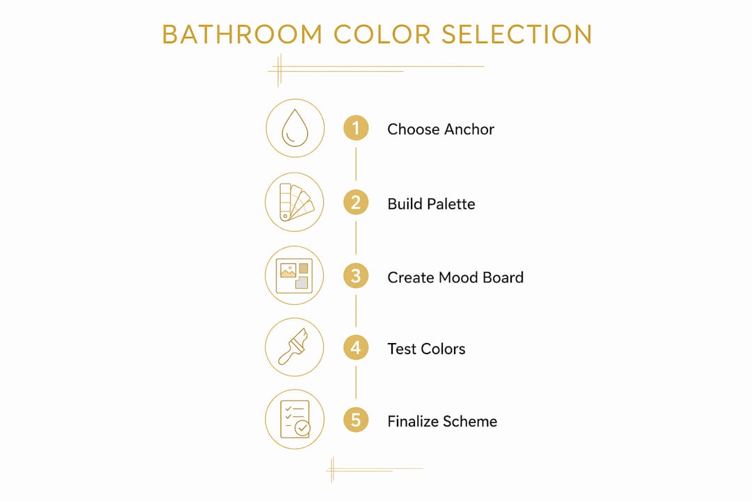
A bathroom color scheme is defined as a curated set of three to five coordinated colors applied across walls, tile, fixtures, and accents to create a unified, functional space. When you select a color scheme for your bathroom renovation, the most effective approach pairs a balanced palette with moisture-resistant paint finishes suited to your lighting and layout. Industry standards recommend a 1:1:1 ratio of dominant neutral to supporting tone to accent color. Getting this foundation right from the start saves you from costly repaints and mismatched materials later.
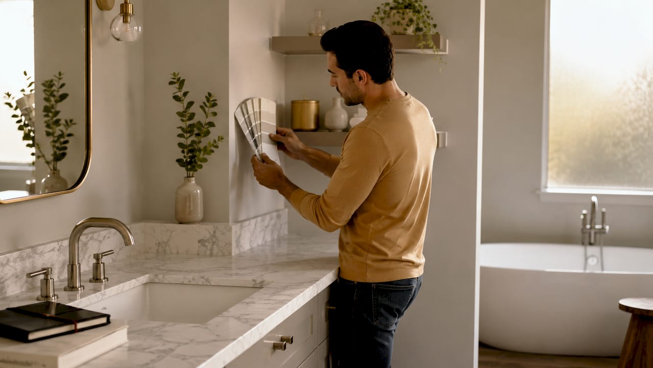
A mood board is the single most practical tool for planning your bathroom color palette. It lets you see all your colors, materials, and finishes together before a single tile is set or a drop of paint is applied.
Start with your fixed elements. Tile and flooring are the hardest and most expensive items to replace, so they become your anchor colors. Designers recommend matching paint to fixed elements like flooring, tile, and metal hardware to avoid visual clashes. Once you have your anchor, build outward.
The 3 to 5 color rule keeps palettes from feeling chaotic. Here is how those colors typically break down:
Testing three directions on your mood board gives you real options. Three testing directions include safe (classic neutrals), stretch (bold choices), and hybrid (a blend of both). Most homeowners end up choosing the hybrid direction because it feels livable without being boring.
Pin physical samples to your board, not just digital swatches. Include paint chips, tile pieces, a metal finish sample, and a fabric or grout swatch. Seeing them together under your bathroom’s actual light changes everything.
Pro Tip: Add a small strip of your existing flooring or countertop to the mood board if you are keeping those elements. Your eye will immediately catch any undertone conflicts before you commit.
| Mood board element | Purpose |
|---|---|
| Tile or stone sample | Sets the anchor color for the whole palette |
| Paint chip (dominant) | Confirms wall color works with tile undertones |
| Paint chip (supporting tone) | Tests the secondary color against the anchor |
| Metal finish sample | Validates fixture warmth or coolness against palette |
| Accent swatch | Checks the 10% pop color for balance |
Paint finish is not just an aesthetic choice. It is a durability decision that directly affects how long your bathroom looks good and how resistant it is to mold.
Semi-gloss is the recommended finish for high-moisture zones like shower surrounds, tub areas, and the wall directly behind a sink. Satin finish works well for general bathroom walls where moisture levels are lower. Both finishes repel water and are easy to wipe clean.
Flat and eggshell finishes absorb moisture and harbor mold spores. This is a critical mistake many homeowners make when choosing bathroom paint. A flat finish may look elegant in a bedroom, but it will blister and grow mold in a bathroom within months.
The 2026 color trends lean toward warm mineral whites, earthy neutrals like terra-cotta and khaki, and nature-inspired greens such as sage and eucalyptus. These tones pair beautifully with unlacquered brass and warm wood accents. They also photograph well, which matters if resale value is on your mind.
Pro Tip: Buy a moisture-resistant primer before applying your topcoat. It adds a protective base layer that extends the life of any finish, especially in older bathrooms with limited ventilation.
Lighting is the most underestimated factor when choosing bathroom colors. The same paint color can look crisp and clean under natural morning light and turn yellow or gray under warm vanity bulbs at night.
Warm incandescent or soft-white LED lighting intensifies yellow and orange undertones. Cool daylight bulbs (5,000K and above) bring out blue and gray tones. Testing paint and tile samples in both morning natural light and evening artificial light reveals undertones you would never catch in a paint store.
Fixture finishes add another layer of color interaction. Chrome and nickel are cool-toned and pair best with blue, cool gray, and crisp white palettes. Brass and matte black are warm-toned and complement greens, warm whites, and earth tones. Mixing a warm paint palette with cool chrome fixtures creates a subtle visual tension that most homeowners notice but cannot name.
Pro Tip: Hold your paint chip against your actual vanity fixture under bathroom lighting before buying a full gallon. The combination you see at that moment is exactly what you will live with every day.
Color psychology gives you a framework for choosing colors that support how you want to feel in the space, not just how you want it to look. This matters most in a primary bathroom, where many people start and end their day.
Sage green promotes relaxation and stress reduction, making it one of the top choices for primary baths designed as personal sanctuaries. Soft blues create a calm, spa-like atmosphere. Warm whites and creamy tones feel welcoming and clean without the clinical edge of bright white.
Bold colors like yellow work best as accents rather than primary wall colors. A yellow accent tile or a set of yellow towels adds energy to a neutral bathroom without making the space feel loud. The same principle applies to deep navy or forest green. Use them on a single feature wall or in cabinetry, not across all four walls.
Warm and earthy tones paired with warm metallic finishes make even modern bathrooms feel inviting rather than showroom-cold. This is the shift happening in 2026 design. Homeowners are moving away from stark, all-white bathrooms and toward layered, textured palettes that feel personal. Your bathroom color palette should reflect how you actually live, not just what looks good in a magazine.
Testing is the step most homeowners skip. It is also the step that prevents the most expensive regrets.
Follow this process before committing to any color scheme:
Pro Tip: If a color looks slightly off under your bathroom lighting, go one shade lighter. Bathroom lighting almost always makes colors appear darker and more saturated than they do in a showroom.
Common mistakes to avoid:
| Mistake | Why it matters | Fix |
|---|---|---|
| Ignoring undertones | Creates visual clashes between surfaces | Test samples against tile and flooring |
| Using flat paint | Absorbs moisture and grows mold | Switch to satin or semi-gloss |
| Testing only in daylight | Misses how evening lighting shifts color | Test under vanity and overhead lights |
| Choosing colors from a screen | Digital colors are not accurate | Always use physical paint chips and samples |
A successful bathroom color scheme requires a 3 to 5 color palette built around fixed elements, paired with satin or semi-gloss finishes, and tested under multiple lighting conditions before renovation begins.
| Point | Details |
|---|---|
| Start with fixed elements | Use tile or flooring as your anchor color before choosing paint or fixtures. |
| Follow the 1:1:1 ratio | Assign 60% dominant, 30% supporting, and 10% accent across all surfaces. |
| Choose the right finish | Use semi-gloss for wet zones and satin for general walls to prevent mold. |
| Test under real lighting | Check samples in morning natural light and evening artificial light to catch undertones. |
| Match fixtures to palette warmth | Pair cool chrome with cool palettes and warm brass with earthy or green tones. |
The most common mistake I see homeowners make is choosing a color they love on a phone screen and ordering five gallons without ever testing it on the wall. Bathroom lighting is unforgiving. It reveals undertones that look invisible in a store or on a device. I have seen a “soft gray” turn lavender under warm vanity bulbs and a “warm white” look yellow under cool overhead lighting. The 48-hour sample test is not optional. It is the difference between a bathroom you love and one you repaint six months later.
The trend shift toward warmer neutrals and calming greens is real, and I think it reflects something deeper than aesthetics. Homeowners want their bathrooms to feel like a retreat, not a utility room. Sage green, warm terra-cotta, and earthy khaki accomplish that in a way that stark white never could. That said, trends should inform your choices, not dictate them. If you love a cool, clean palette with crisp white and chrome, that is still a strong choice. Build your bathroom renovation style around how you live, not just what is popular this year.
One more thing: resale value matters, but it should not paralyze you. Neutral palettes with quality finishes hold their value well. Bold accent choices in tile or cabinetry can be updated more easily than people think. Make a space you genuinely enjoy. The right palette, tested properly and finished correctly, will serve you for years.
— Anna
Choosing the right colors is only part of a successful bathroom renovation. The materials, finishes, and installation quality determine how long that palette holds up.
The Kitchen, Bathroom & Flooring Store offers bathroom remodeling packages designed to fit a range of budgets, with expert guidance on color schemes, paint finishes, tile selection, and fixture coordination. Our team handles everything from initial design consultation through professional installation, so you never have to manage multiple contractors. You can also browse our bathroom cabinet options to see how popular 2026 tones like sage green and warm white translate into real cabinetry finishes. Visit our Jacksonville showroom or connect with us online to get started.
The ideal palette uses 3 to 5 colors in a 1:1:1 ratio of dominant neutral, supporting tone, and accent. Keeping the palette tight prevents the space from feeling visually cluttered.
Semi-gloss is best for high-moisture zones like shower walls and areas near the sink. Satin finish works well for general bathroom walls and resists mold better than flat or eggshell finishes.
Warm mineral whites, earthy neutrals like terra-cotta and khaki, and nature-inspired greens such as sage and eucalyptus are leading 2026 bathroom color trends. These tones pair well with unlacquered brass and warm wood accents.
Light colors for small bathrooms work best because they reflect light and make the space feel larger. Stick to your dominant neutral on walls and ceiling, and reserve deeper tones for a single accent surface like a vanity or feature tile.
Chrome and nickel fixtures pair best with cool palettes like blue, gray, and crisp white. Brass and matte black fixtures complement warm palettes including greens, earth tones, and warm whites. Mismatching fixture warmth with paint undertones creates a subtle but noticeable visual conflict.